In honor of the team’s 10th anniversary — has it really been that long? — the Brockton Rox (independent; Can-Am League) unveiled new team logos and colors for the 2011 season.
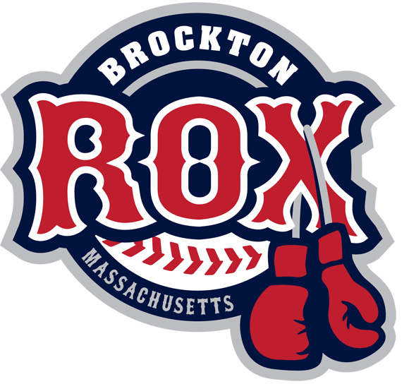
 Interestingly, the team went with different designers for different marks. The team’s principal mark (above), designed by Todd Malhoit of Detroit-based Original Design Group, features the club’s name in red letters in front of a baseball, with boxing gloves hanging off of the “X.” The gloves are a reference to Brockton’s status as the “City of Champions,” as the city is the hometown of boxing legends Rocky Marciano and Marvin Hagler.
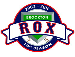
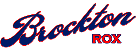
The club also unveiled a tenth-season logo (to the right), as well as a script wordmark for the team’s uniforms, created by Richie Berry of G&B Creative Solutions. The club’s hat logo will use the “B” from the wordmark. Both are below.
 “Developing a new image for the Rox has been an exciting process, and we’re pleased with the final results,” club president Chris Carminucci said. “We felt that our tenth season was a great time to do a total rebranding, and it’s one of the many changes that fans will see at Campanelli Stadium this season.”
Share your news with the baseball community. Send it to us at editors@augustpublications.com.
Subscribers to the weekly Ballpark Digest newsletter see features before they’re posted to the site. You can sign up for a free subscription at the Newsletter Signup Page.
Join Ballpark Digest on Facebook and on Twitter!