The Lancaster Barnstormers (independent; Atlantic League) are sporting a new look this season, with uniforms and logos riffing off the team’s successful rural barn theme dating back to the team’s 2005 inception.
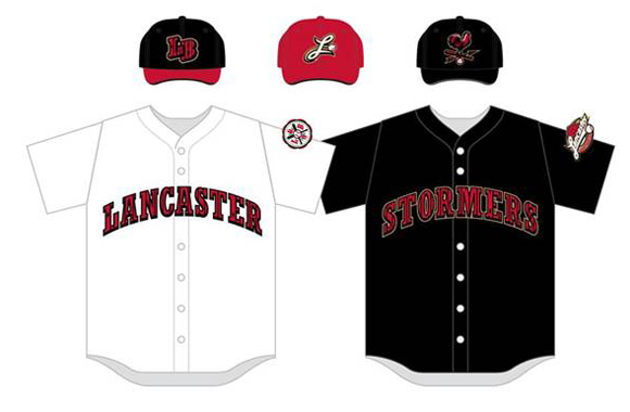
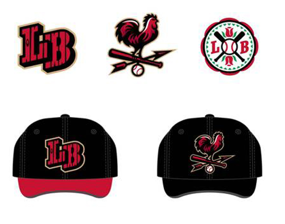
The barn motif can be seen in three looks. The first and most comprehensive is that “plank” markings, indicating the basic framework of Lancaster agricultural life, appear throughout the redesigned uniforms. This design shows up in the word “Lancaster” on the front of the main jersey, in the “LB” logo on the new weeknight caps, and in the word “Stormers” on the front of the Saturday uniform top.
The primary home jerseys will also now feature a hex symbol, which uses Lancaster’s traditional red rose as well as the letters “L” and “B.”
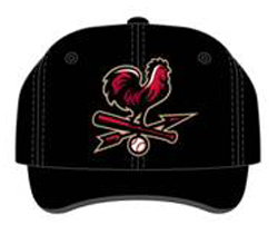
Finally, there’s a weathervane-style cap logo that will be used on the team’s Saturday night home hats.
“With a new team and a new manager for our seventh season, we took the opportunity to freshen up our brand and add further dimension to our identity,” said Barnstormers President Jon Danos. “Our intention is not to replace the signature look, but rather to enhance it.”
—
Share your news with the baseball community. Send it to us at editors@augustpublications.com.
Subscribers to the weekly Ballpark Digest newsletter see features before they’re posted to the site. You can sign up for a free subscription at the Newsletter Signup Page.
Join Ballpark Digest on Facebook and on Twitter!