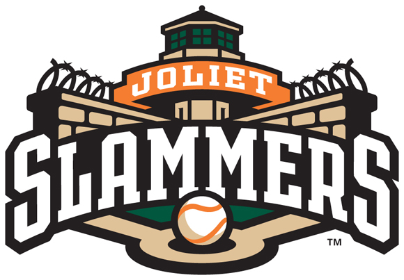
It was an edgy design that embraced, rather than ignored, Joliet’s penal history. In the end, a distinctive logo and look helped catapult the Joliet Slammers (independent; Frontier League) to a successful inaugural season and garnered recognition from Ballpark Digest for 2011 Logo of the Year.
 Setting up operations at Silver Cross Field was going to be a huge challenge for the new owners of a Joliet baseball team: the previous tenants had failed under some pretty bad circumstances, and the new management needed to convince fans they were legitimate. They did so in a completely counterintuitive way: by embracing a team name (Slammers) and look that embraced the city’s history of hosting a notorious state prison.
It worked; today the Frontier League’s Joliet Slammers have won back the local fan community. Plus, the edgy logo and branding are just plain cool, which is why the Slammers are honored for creating the 2011 Logo of the Year award from Ballpark Digest, the leading guide to baseball and ballparks on the Internet.
“A lot of folks would have recommended the Slammers play it safe when coming into such a tense situation,” said Kevin Reichard, publisher of Ballpark Digest. “But embracing the jailbird theme showed the front office to be good-natured and edgy, raising the team’s profile in the community.”
Designed by Dan Simon of Studio Simon in Louisville, the Joliet logos feature a jailbird and a version of the guard tower at Joliet Correctional Center, the infamous prison dreaded by convicts and later immortalized by the Blues Brothers. Team promotions included the unveiling of a mascot, J.L. Bird, wearing a striped prison uniform.
“We wanted something edgy but relevant to Joliet,” said Slammers GM John Dittrich. “After many meetings and discussions among ourselves and with Dan Simon, Slammers passed the test better than any other name. Dan Simon is truly a talent, and he took it from there with the logo design.”
“We love the jailbird theme: it’s fun and it’s certainly unique to Joliet,” Reichard said. “Taking chances is what distinguishes a great company in the marketplace, and the success of the Slammers for this year and beyond can be attributed directly to taking a chance with the Slammers logo and design.”
On the next page: other strong logos released for the 2011 season.
There were other strong logos released for the 2011 season. Here’s a listing (in alphabetical order) of the new logos and designs that merited recognition.
Altoona Curve
The Altoona Curve (Class AA; Eastern League) unveiled a new set of logos and team colors for the 2011 season, as the team extends an emphasis on local rail history, embodied by the Pennsylvania Railroad.
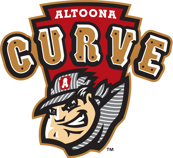
The new look, designed by Plan B. Branding, pays tribute to the Pennsylvania Railroad, the largest in America during the first half of the 20th century. The new primary logo features the club’s new engineer character over the famous Pennsylvania keystone icon. The PRR’s workhorse, the K4 steam locomotive, provided the inspiration for the team’s new riveted ‘Curve’ lettering.
Here’s our original story on the release of the Curve logos.
Here’s our original story on the unveiling of team caps and uniforms.
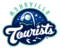 Asheville Tourists
Drawing on the colorful history of baseball in the area and the scenic nature of McCormick Field, the Asheville Tourists (Low Class A; Sally League) unveiled a new logo, color scheme and identity for 2011.
The ball going over the moon has multiple meanings in the new identity created by Plan B. Branding. First, it hearkens back to the earliest days of Asheville baseball, when the Asheville team in the Class D Southeastern League (1910) and the Appalachian League (1911-12) was known as the Moonshiners. The color schemes, meanwhile, pay tribute to the city’s hallmarks, including Midnight Navy, Blue Ridge Blue and Biltmore Jade. A new typeface, which will be used for both “Asheville” and “Tourists” as well as the “A” on caps, was rendered in the area’s craftsman style.
Here’s our original story on the release of the Tourists logo.
Here’s a story on Mr. Moon, the team’s new mascot.
Here’s a story on the team’s new uniforms.
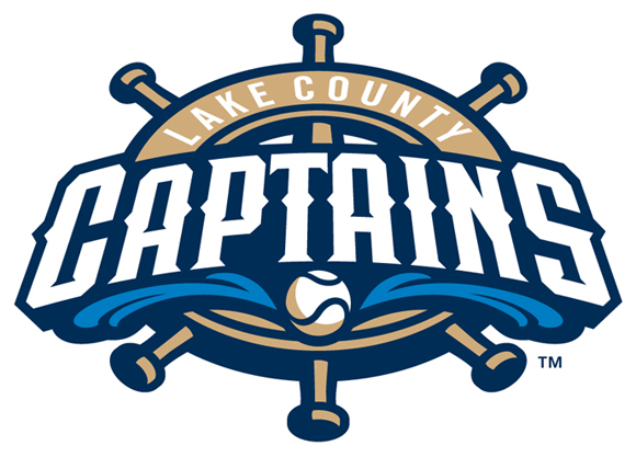
Lake County Captains
The Lake County Captains (Low Class A; Midwest League) unveiled a new logo, colors and team identity today, dropping the cartoonish riverboat captain and embracing a more modern design from Simon Studio.
The new primary logo solidifies the Captains nautical theme and the organization’s ties to Lake County. The primary colors in the new scheme will be navy blue, light blue, tan, yellow and flesh. The primary logo features a ship wheel with the new “Captains” script font across the center with a baseball below the name coming out of a wave of water. The handles of the ships wheel represent the knobs of baseball bats.undertook the first redesign in club history.
Here’s our story on the original release of the new logo and look.
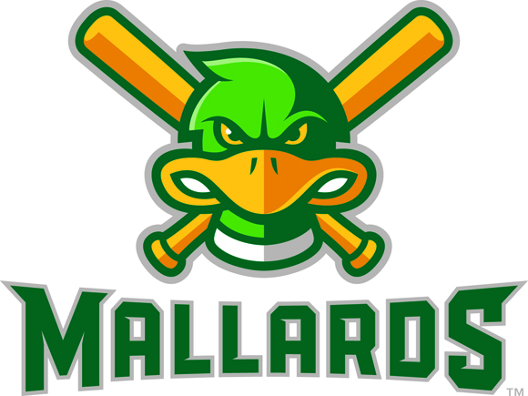 Madison Mallards
As part of the makeover of Warner Park for 2011, the Madison Mallards (summer collegiate; Northwoods League) unveiled new logos from Shine Advertising in Madison.
The new logos feature a slightly more menacing Maynard Mallard, replacing the original logo created when the team joined the Northwoods League more than 10 years ago.
In addition, the team unveiled a new, edgier Maynard G. Mallard mascot. It was a risk: the old Mallard logo and mascot were considered to be kid-friendly, but it didn’t appear to us that the new logo or Maynard G. Mallard logo was any more scarier to kids than the old one.
Here’s our story on the logo release.
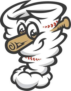 Omaha Storm Chasers
It’s hard to create a look for a meteorological event, but the Omaha Storm Chasers (Class AAA; Pacific Coast League) managed to pull off a name change and identity overhaul with a new logo and new mascots.
The new look was especially dramatic when you considered the team walked away from the Omaha Royals name, used beginning in 1969 when the team was actually owned by parent Kansas City Royals, except for a three-year (1999-2001) stint as the Omaha Golden Spikes.
The new look and logos came from Plan B. Branding and features two new mascots, Vortex (shown at right) and Stormy.
Here’s our original story on the announcement of the Storm Chasers logo and mascots.
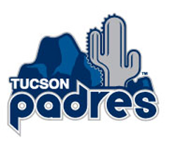
Tucson Padres
The Tucson Padres (Class AAA; Pacific Coast League) drew on the history of parent club San Diego Padres — and the services of the MLB team’s creative staff — to come up with a logo that combined a desert look with a retro Padres logo.
The design comes from San Diego Padres Creative Services Department and incorporates the old-style Padres lettering from 1978-1984 with the current Padres colors. The logo has a Tucson feel with the artistic addition of the cactus and mountain, synonymous with the Old Pueblo.
Here’s our original story on the logo release.
Here’s a story on the team uniforms and cap design.
ABOUT THE BALLPARK DIGEST AWARDS
Each year Ballpark Digest honors noteworthy accomplishments in the baseball world, whether it be Major League Baseball, Minor League Baseball, independent baseball, summer-collegiate baseball or college baseball. Readers are asked to submit nominations for awards in specific categories; Ballpark Digest editors then go though the submissions (numbering some 400 pages of documentation last year). The awards cover both individual accomplishments as well as team accomplishments. This is the fourth season for the Ballpark Digest Awards. A complete listing of Ballpark Digest Awards can be found at ballparkdigest.com/awards.
ABOUT BALLPARK DIGEST/AUGUST PUBLICATIONS
The leading Website covering the culture and business of baseball since its inception in 2002, Ballpark Digest (ballparkdigest.com) has been called an “indispensable” guide to baseball and ballparks by The New York Times; it’s been used as a source by publications and Websites ranging from The Wall Street Journal to Epicurious.com. August Publications is a publisher based in Middleton, Wis. Besides Ballpark Digest, August Publications’ leading Websites include SpringTrainingOnline.com, ArenaDigest.com and YellowstoneInsider.com.
—-
Share your news with the baseball community. Send it to us at editors@augustpublications.com.
Subscribers to the weekly Ballpark Digest newsletter see features before they’re posted to the site. You can sign up for a free subscription at the Newsletter Signup Page.
Join Ballpark Digest on Facebook and on Twitter!